Click here to read this mailing online.
![]()
Here are the latest updates for woowonenature@gmail.com
"Larry Ferlazzo's Websites of the Day..." - 8 new articles
- British Library Makes One Million Public Domain Images Available Online
- This Week In Web 2.0
- Video: “Chicago’s Magical Piano”
- Chart: “Most States Have Cut K-12 Per Student Funding Since 2008″
- The Best Infographics Of 2013 – Part Two
- EVO Is One Of The Best Opportunities For Free Online ESL Teacher Professional Development
- This Week’s “Round-Up” Of Useful Posts On Education Policy
- A Collection Of My “Best” Lists On The Common Core
- More Recent Articles
- Search Larry Ferlazzo's Websites of the Day...
- Prior Mailing Archive
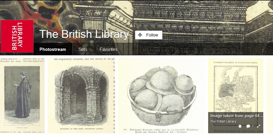
British Library Makes One Million Public Domain Images Available Online
Wow! The British Library has just uploaded one million public domain images online. You can read all about it at Boing Boing. I’m adding this info to The Best Online Sources For Images. This Week In Web 2.0 In yet another attempt to get at the enormous backlog I have of sites worth , I’ve recently begin a regular feature called “The Week In Web 2.0.” (you might also be interested in The Best Web 2.0 Applications For Education In 2013): 25 Sites For Creating Interesting Quote Images is from Edudemic. I’m adding it to The Best Tools For Creating Visually Attractive Quotations For Online Sharing. ClassFlow is a new tool being unveiled by Promethean in January. They say that “Beginning in January 2014, teachers will be able to sign up for a complimentary ClassFlow account.” It looks pretty interesting, though I’ve got to wonder what it’s cost structure is going to end up being. I suspect that Promethean isn’t going to make it entirely free forever, but maybe I’m just being cynical. Here’s a video overview of it:
Canva is a new tool for creating infographics. You can learn more about it at Richard Byrne’s blog. I’m adding it to The Best Resources For Creating Infographics. Video: “Chicago’s Magical Piano”This would be a good video to show to English Language Learners and have them describe what was happening — in writing and verbally. And, it’s a fun video for anyone to watch!
Chart: “Most States Have Cut K-12 Per Student Funding Since 2008″This chart is from The Center On Budget And Policy Priorities. I’m adding it to The Best Sites For Learning That Money Does Matter For Schools. The Best Infographics Of 2013 – Part Two
Infographics show data in a visual way, and make the information much more accessible for English Language Learners — and everybody else. Interactive infographics are especially engaging because they allow users to customize the data they see. You’ll find both kinds in this list. You might also be interested in: The Best Infographics Of 2013 – So Far The Best Infographics Of 2012 — So Far The Best Infographics Of 2011 — So Far The Best Interactive Infographics — 2009 The Best Sources For Interactive Infographics. The Best Resources For Creating Infographics The Best Resources For Learning About “Word Clouds” Not “The Best,” But “A List” Of Mindmapping, Flow Chart Tools, & Graphic Organizers The Best Tools To Make Simple Graphs Online The Best Sites For Learning About Cartograms The Best Map-Making Sites On The Web The Best Posts To Help Understand Google’s New “Books Ngram Viewer” A Collection Of “The Best…” Lists On Infographics The Best Infographics About Teaching & Learning English As A Second (or Third!) Language The Best Infographics About Parent Involvement In Schools You also might want to check out my Pinterest boards for more infographics. Here are my choices for The Best Infographics Of 2013 – Part Two: The 2013 “Global Teachers Status Index” is a pretty interesting interactive. Exploiting Infographics is an excellent downloadable PDF from Nik Peachey that’s useful for ELL teachers and everyone else, too. Critical Thinking via Infographics is from Langwitches. The Global Carbon Atlas is quite an impressive interactive. I’m adding it to The Best Sites To Learn About Climate Change. An interactive migration map of the United States is a Boston Globe article about this fascinating county-by-county migration interactive. Here’s a great new infographic version of Pixar’s rules for storytelling that was co-designed by TED Talks. I’m adding it to The Best Digital (& Non-Digital) Storytelling Resources. Watch the growth of U.S. income inequality with this animated map is from The Washington Post. I’m adding it to The Best Resources About Wealth & Income Inequality. America does not have equal opportunity, in one chart is from The Washington Post. I’m adding it to The Best Resources About Wealth & Income Inequality. Information Is Beautiful, the world’s premiere resource for infographics, announced their 2013 Longlist and winners for infographic and interactive awards. It’s an amazing collection. You might also be interested in last year’s nominees, too. Your Brain Map: 84 Strategies For Accelerated Learning is an impressive interactive. This is a great blog with infographics showing the “sound” that various animals make in different languages. Climate change: how hot will it get in my lifetime? – interactive is a good interactive from The Guardian — type in your birthdate and you get the answer. I’m adding it to The Best Sites To Learn About Climate Change. The Associated Press has an interactive on 2012 poverty rates in the United States. I’m adding it to The Best Visualizations Of Poverty In The U.S. & Around The World. The Guardian has published a slideshow of 16 useless infographics which also includes short explanations about what is wrong with each one. It’s a perfect teaching tool to use prior to having your students create an infographic, which is why I’m adding it to The Best Resources For Creating Infographics. One caution, however — the second slide is pretty gross, so I’d skip over that one quickly. Here’s a good infographic on Finland’s school system. I’m adding it to The Best Resources To Learn About Finland’s Education System. Readers Around The World is a fascinating infographic map. I’m adding it to The Best Sites For Learning About The World’s Different Cultures. Mapping children’s chances is a fascinating series of maps from The BBC.

I’m adding this infographic to The Best Resources To Learn About World Teachers Day: 

I’m adding this infographic to The Best Websites For Learning About Natural Disasters: 
Here is a new additions to The Best Resources To Learn About Copyright Issues:
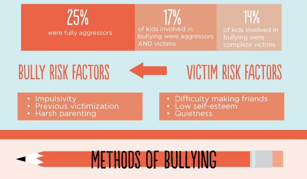
I’m adding this infographic to A Very, Very Beginning List Of The Best Resources On Bullying. I’m displaying it in a couple of ways because I like it a lot and want it to be accessible, but the original formatting is a bit “funky”: You can see a better version here.
I’m adding this infographic to The Best Resources For World Literacy Day:
Here’s a nice infographic from Sarah Sparks at Education Week: I think this infographic would be a useful one to show students prior to their creating one. I’m adding it to The Best Resources For Creating Infographics: 
I’ve got to add this infographic to The Best Resources For “Moon Day”:
How Green Is My State? is a pretty cool interactive infographic giving assessments for each U.S. state on a number of environmental factors:
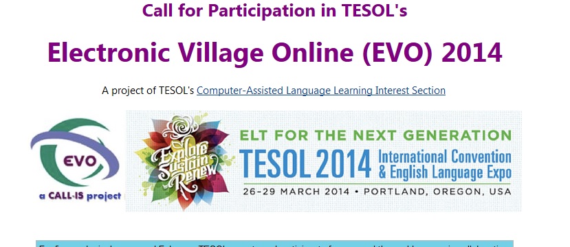
EVO Is One Of The Best Opportunities For Free Online ESL Teacher Professional Development
The Electronic Village Online is an annual event that’s on The Best Places For ESL/EFL/ELL Teachers To Get Online Professional Development list, and it’s that time again. Here’s the announcement: For five weeks in January and February, TESOL experts and participants from around the world engage in collaborative online discussions or hands-on virtual workshops of professional and scholarly benefit. These sessions bring together participants for a longer period of time than is permitted by land-based professional development conventions and allow a fuller development of ideas than is otherwise possible. Sessions are free and open to anyone around the globe. It is not necessary to attend the TESOL Convention in order to participate. All you need is access to the Internet. Choose a session from this year’s offerings, listed below. And please inform your colleagues about this unparalleled professional development opportunity! Nina Liakos
Visit the Call for Participation in TESOL’s Electronic Village Online (EVO) 2014 for the details… This Week’s “Round-Up” Of Useful Posts On Education Policy Here are some recent useful posts and articles on educational policy issues: The Teacher Gap: More Students and Fewer Teachers is from the Economic Policy Institute. The Meaning of PISA is by Marc Tucker at Ed Week. I’m adding it to The Best Posts & Articles On 2012 PISA Test Results. Attention OECD-PISA: Your Silence on China is Wrong is by Tom Loveless. I’m adding it to the same list. “PISA Day”—An Ideological and Hyperventilated Exercise is by Richard Rothstein. I’m adding it to the same list. After Setbacks, Online Courses Are Rethought is from The New York Times. I’m adding it to The Best Posts & Articles On MOOC’s. A Collection Of My “Best” Lists On The Common Core I’ve published several “Best” lists related to the Common Core, and thought that readers might find it useful if I brought them all together. I was prompted to do this tonight after reading a good post: Five myths about the Common Core by Valerie Strauss in The Washington Post. Here they are: The Best Articles Sharing Concerns About Common Core Standards The Most Useful Resources For Implementing Common Core Q & A Collections: Implementing The Common Core is one of my posts over at Education Week Teacher. It brings together all my posts there on…the Common Core. The Best Resources For Talking To Parents About The Common Core Standards The Best Resources For Learning About Common Core Standards & English Language Learners The Best Resources For Learning About The “Next Generation” Of State Testing
More Recent Articles |